Ngopilah, Mobile App for Coffee Shop
Project Background
I designed a mobile app for a coffee shop near an office area to conceptualize a digital solution aimed at improving customer convenience and enhancing their overall experience. The focus was on understanding the needs of busy professionals and creating a design that aligns with the coffee shop's modern brand identity.
People Problem
Many workers lack time to drink coffee at home due to tight schedules and limited breaks. Consequently, they often make their own coffee at work, which lacks the variety and flavor of coffee shop options. Buying coffee near their workplace usually involves long queues, wasting their limited break time and adding stress. This issue is worse during peak hours, increasing frustration. Some workers even skip coffee altogether, impacting their productivity and enthusiasm. The difficulty in accessing quality coffee highlights the urgent need for a more efficient and user-friendly solution that can fit seamlessly into their busy routines.
Goal
The goal of this project is to reduce customer waiting times, improve operational efficiency, and enhance customer satisfaction through the optimization of UI/UX design. With the right solution, I hope to expedite the service process without compromising quality, and provide a smoother and more convenient ordering experience for customers. This is also expected to help the coffee shop manage the increase in customers better and maintain its positive reputation.
Challenge
This issue is interesting because it involves optimizing the workflow to improve efficiency without sacrificing the quality of the user experience. Some of the main challenges in UI/UX design for this project include:
An intuitive interface design
Designing an intuitive interface so that users can easily understand how to order coffee through the app without requiring additional guidance. The challenge includes balancing a simple and straightforward design with the need for a complete set of features to ensure all important options are available without confusing users
Pickup time selection feature
This feature allows customers to order coffee at any time and from anywhere without needing to queue at the coffee shop. They can choose a pick-up time that fits their schedule, ensuring that the order stays fresh when they receive it. The main challenge here is to accommodate various customer schedules while maintaining flexibility without adding complexity to the existing app flow
Solution
This issue is interesting because it involves optimizing the workflow to improve efficiency without sacrificing the quality of the user experience. Some of the main challenges in UI/UX design for this project include:
A minimalist design with clear navigation.
Creating a simple ordering page layout with easily understandable visual elements.
Using icons and labels that are familiar to the general public so they know what actions to take.
Integration of a clock for time selection
Using a responsive and easy-to-use time selection feature.
Status
Displaying order status that needs to be paid and remaining time for orders being processed.
Role and Responsibility
I handled the entire project, both from the UI and UX perspectives.
Target Users
The target users include students, professionals, freelancers, and of course, coffee lovers.
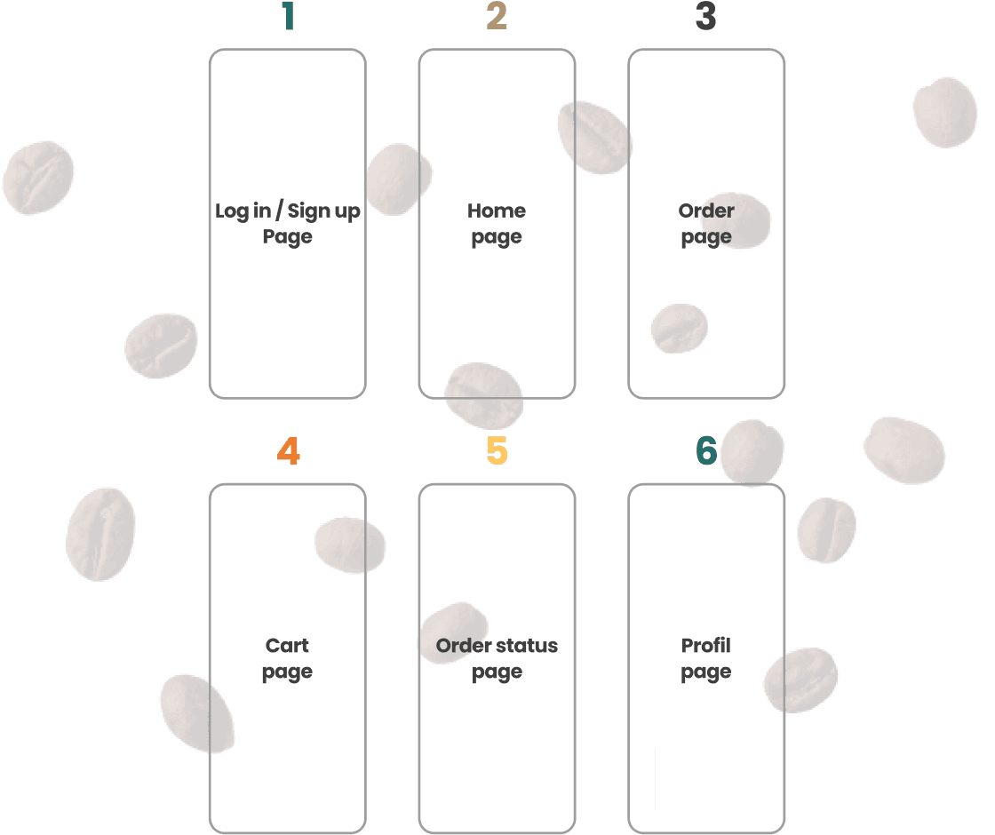
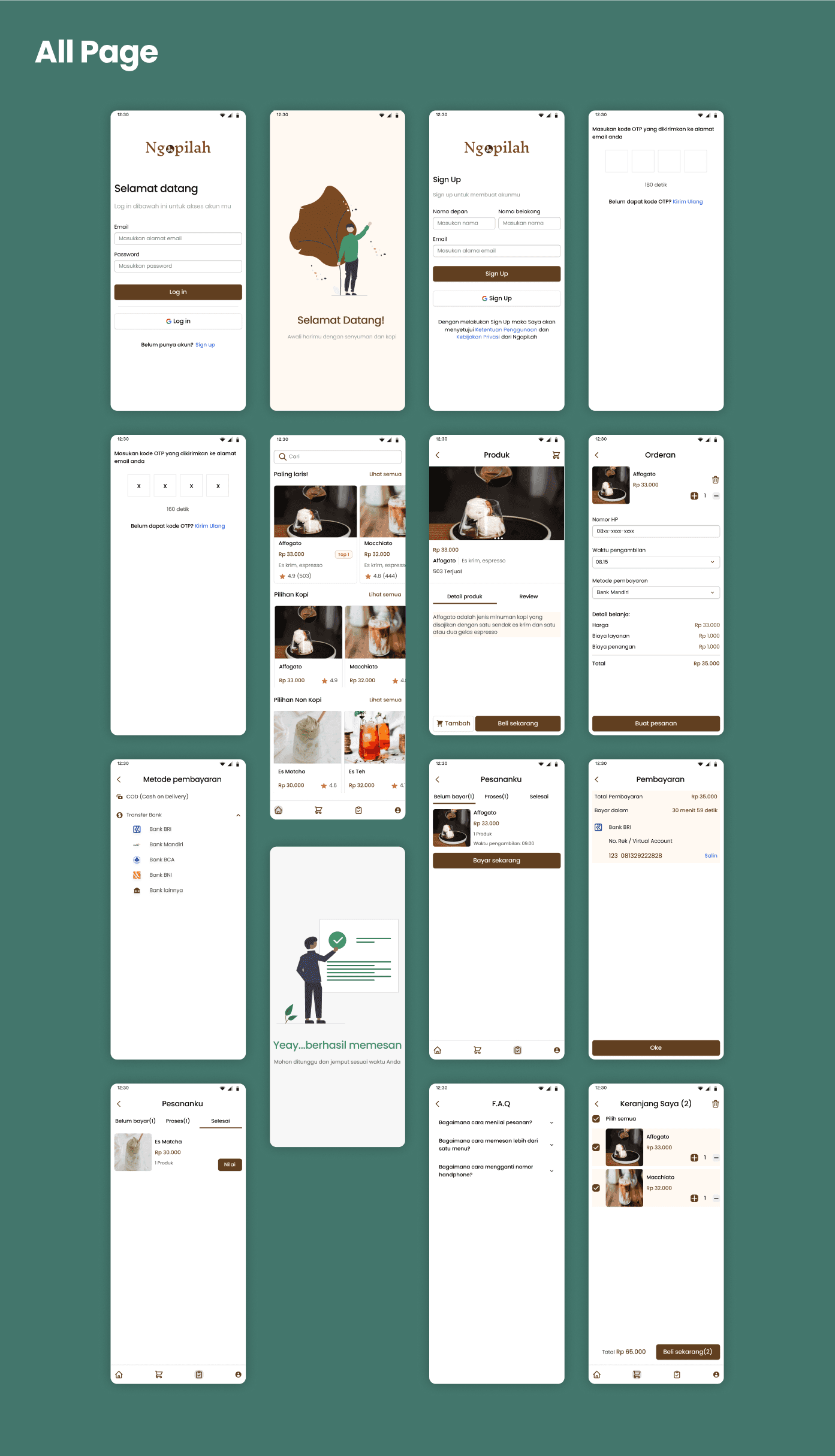
Scope
I will create several fundamental pages for an application to order drinks so that users can become familiar with the app and easily place orders. Here are the pages I will create:
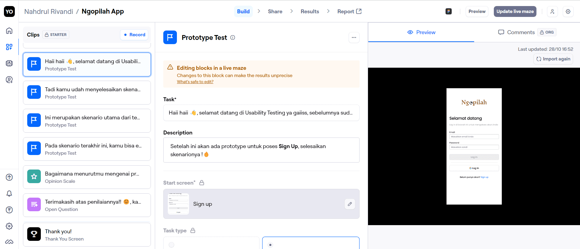
Usability Testing
In this process, 3 participants will interact directly with the application through Maze and complete the tasks that have been prepared within it.
There are 4 tasks that the user will complete:
After completing all the scenarios, the users will then provide an overall rating of the application using the Opinion Scale. The image below shows the results of the Opinion Scale, with an average rating of 4.7.
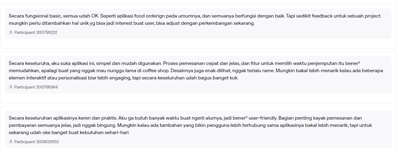
After receiving the rating scale for this application, the next step is the Open Question, where users can provide comments, suggestions, and feedback regarding the process they have gone through.
Then, I gave the users the freedom to explore the prototype in Figma in-depth so that they could provide detailed feedback on each page or feature. During this process, I invited them to a Zoom meeting and observed them as they navigated through the application.
After that, I received in-depth feedback from them, as follows:
Key Insight
The main issue identified with the Ngopilah app is as follows:
Users need onboarding to understand the app’s key features.
They also need features that can increase their engagement with the app, such as promotions, vouchers, bookmarks, or even notifications, allowing them to receive real-time information.
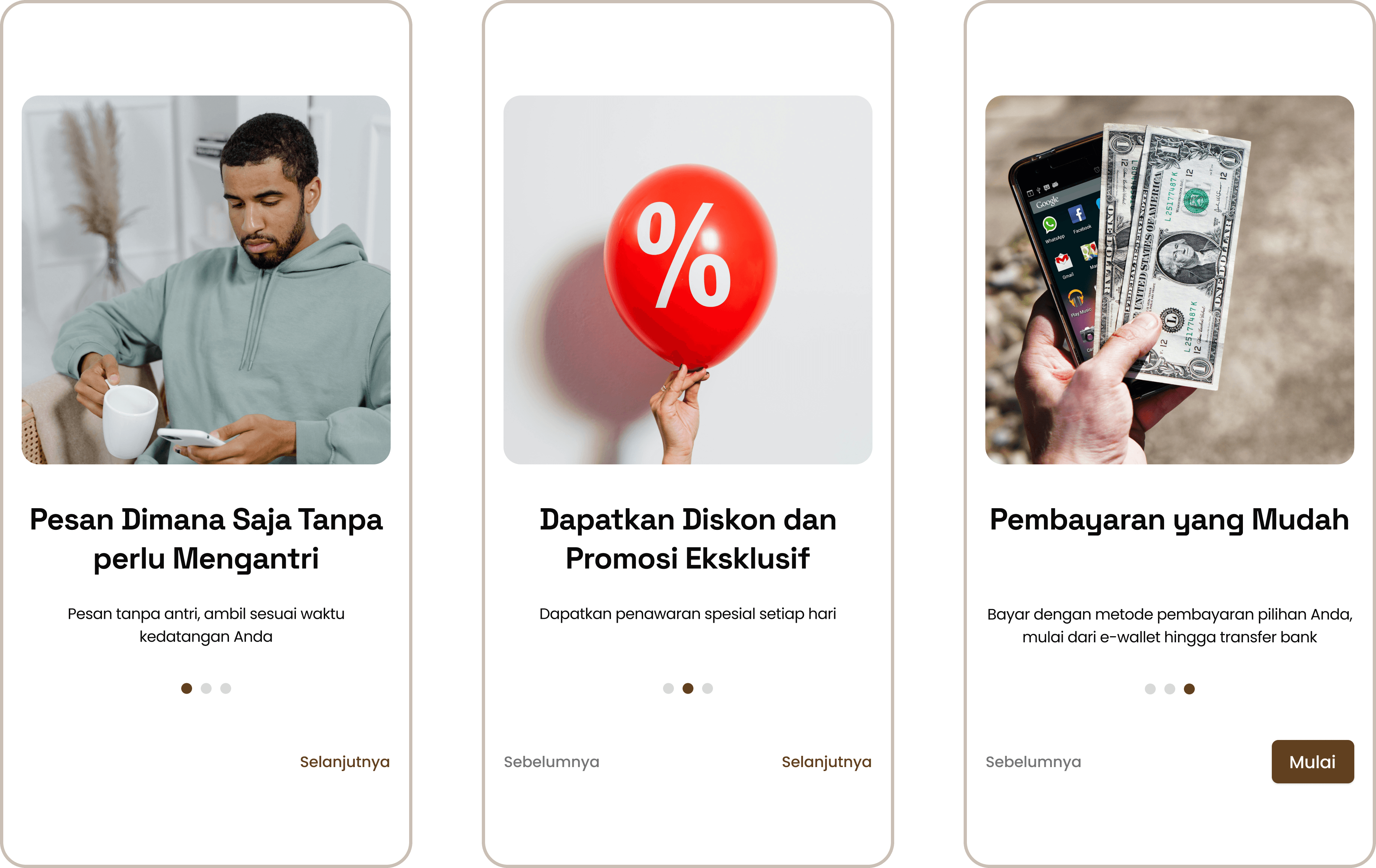
And the addition of three onboarding pages
Let’s Work Together
If you have a project or a job opportunity in mind, I would like to hear from you.