/
Redesign The KAI Train Website
KAI Train Website (Redesign)
Project Background
KAI Access is the official application from PT KAI, released to meet the needs of passengers for long-distance, medium-distance, and local/commuter trains. However, due to its outdated appearance and confusing UX, we decided to redesign this website.
Problem
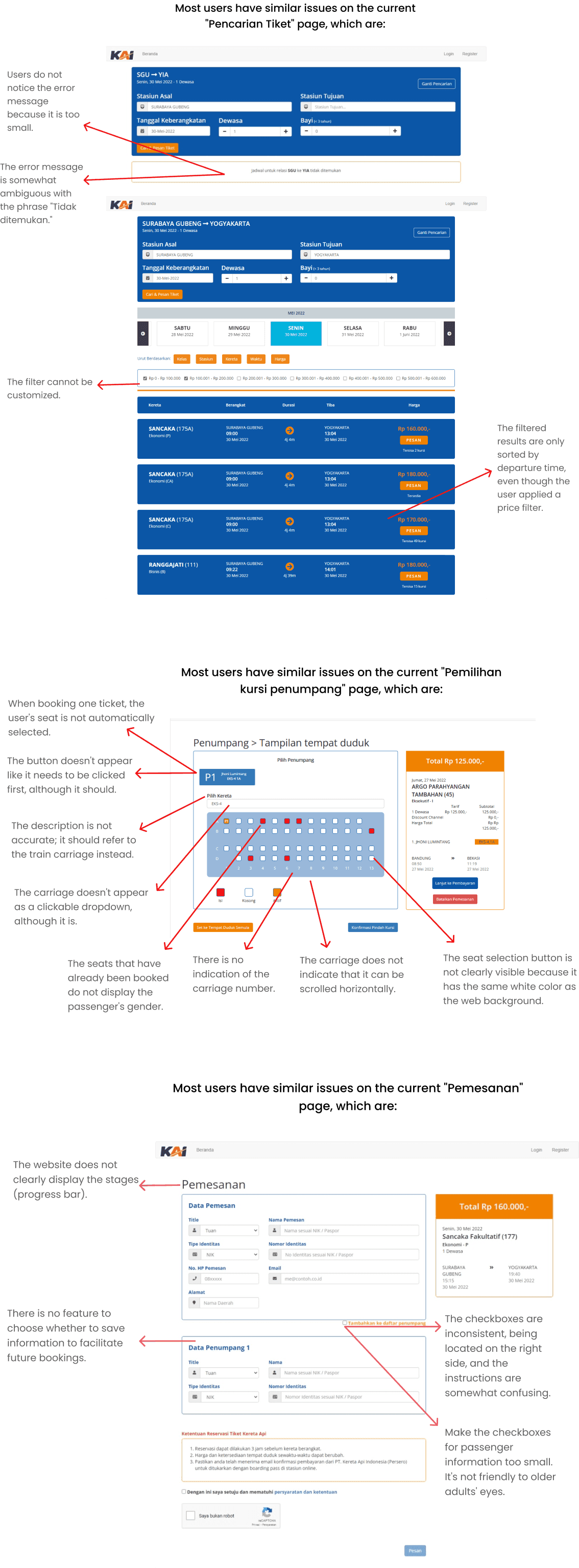
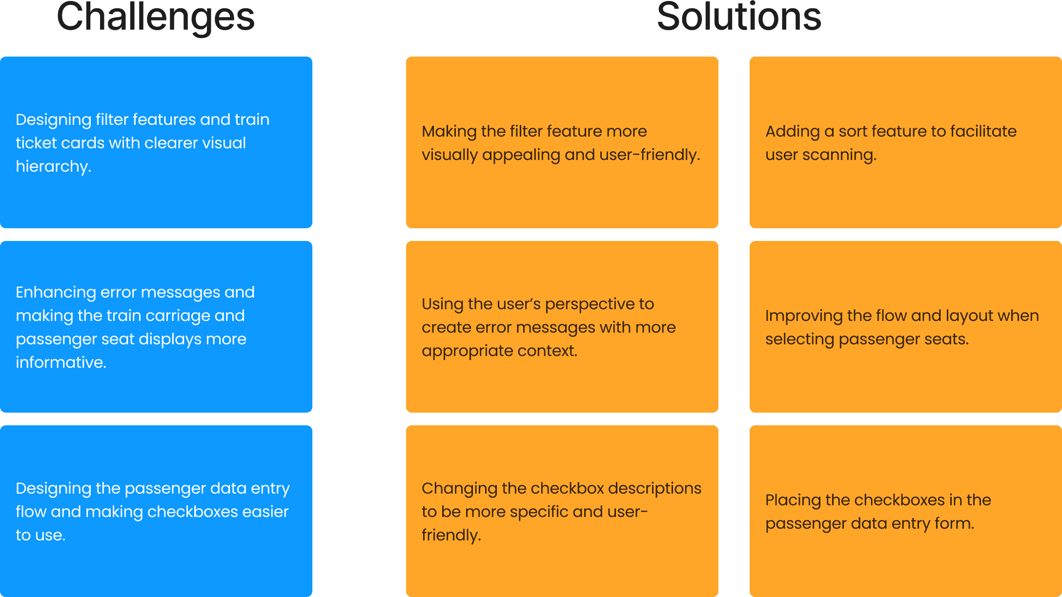
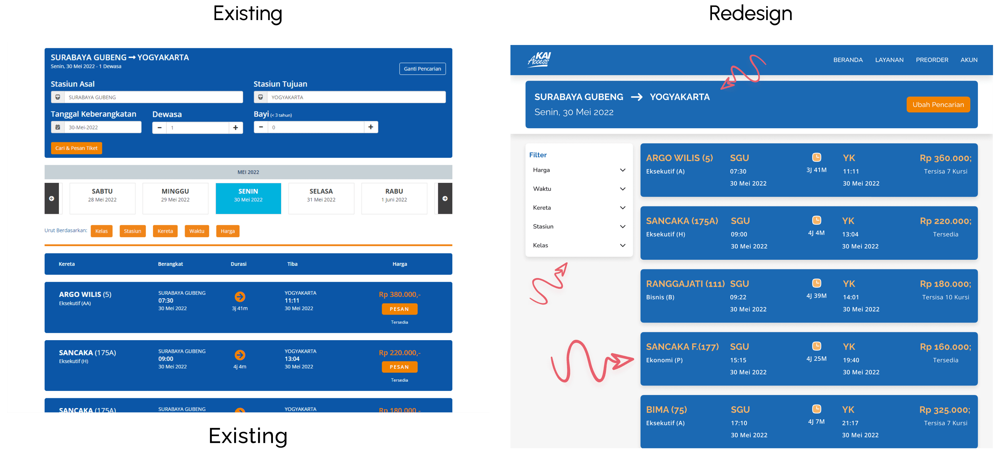
Interesting insights that are the main issues in the current KAI Access website design:
1. Users have to read the details of each card because the system only sorts by departure time (even if users use filters like price, etc.).
2. Users directly click on the seat in the carriage because the passenger box does not appear to be a button that needs to be clicked first.
3. Users take longer to find and understand the function of the checkbox.
Here are the details of the issues on the pages.
Goal
Based on the issues found above, the goal of this redesign is to address these findings so that users can book tickets for their trips comfortably, quickly, and accurately.
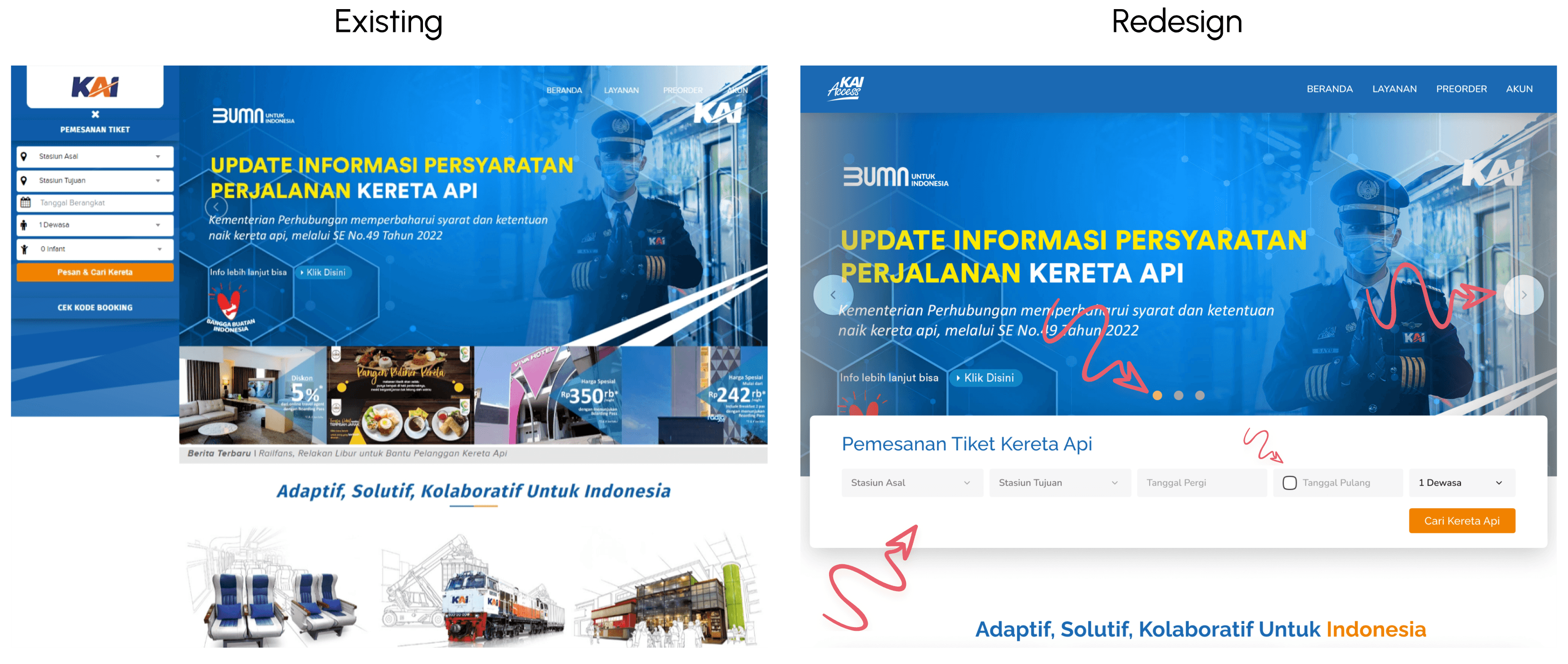
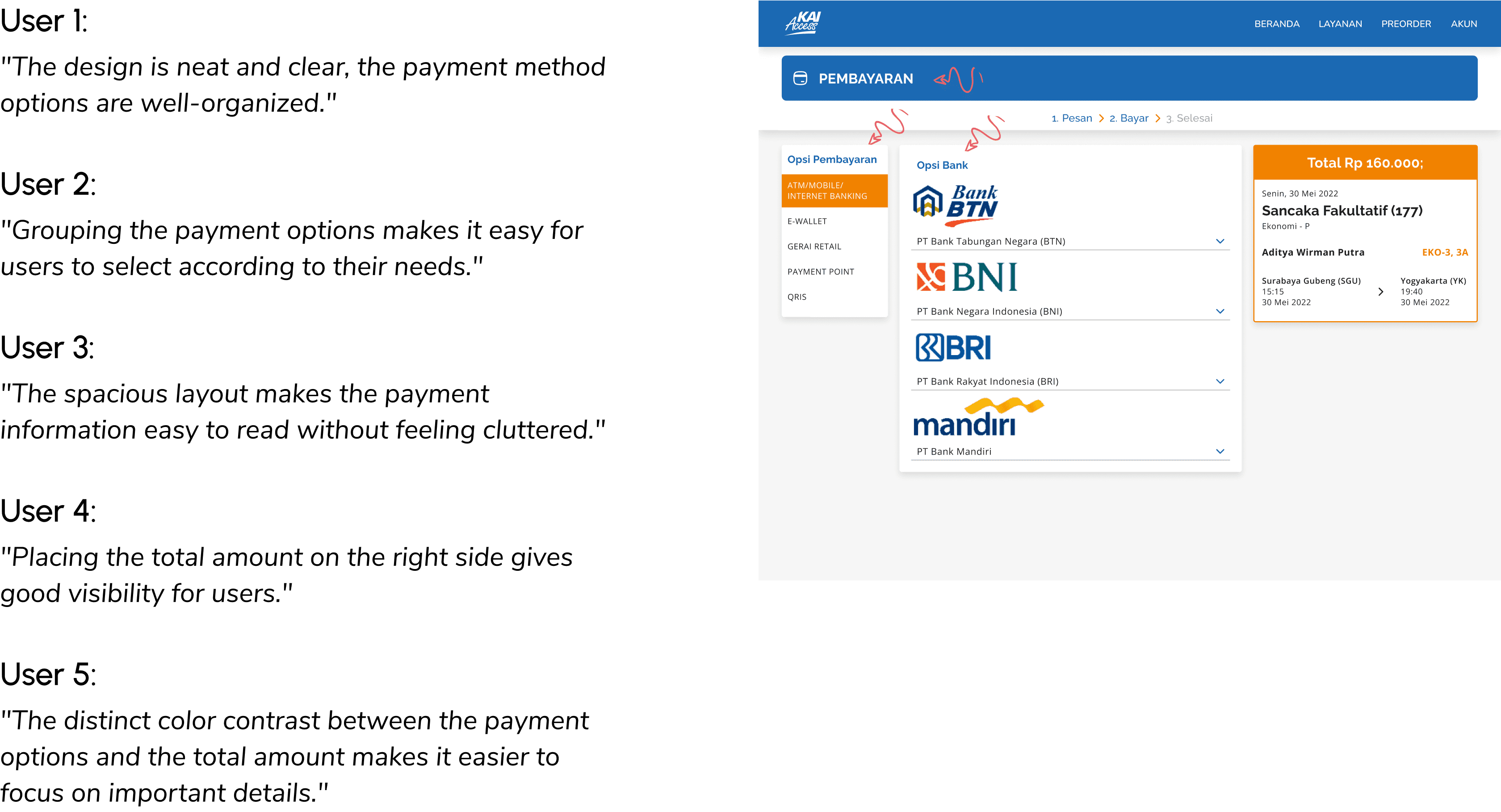
Redesign Result
Here are the results of the redesign we have completed.
Usability Testing
We conducted Usability Testing to evaluate and collect user feedback after redesigning the website. I conducted observations and interviews then continued with filling in the overall score of the test scenarios that had been conducted. The image below shows the overall assessment results after redesigning the KAI website.
1 = Very poor
2 = Poor
3 = Average
4 = Good
5 = Excellent
…
Conclusion
The final result of this redesign shows that there are still some aspects that need improvement. One significant note is that our solution, although intended to provide convenience, has created a new issue—information about the gender of the reserved seats has the potential to be misused. Based on the feedback we received, we realized the need for further iterations. I am looking forward to continuing this process by addressing the problematic areas to produce a redesign that is safer and more user-friendly. Currently, the process is on hold after receiving useful feedback, but it is ready to move forward to the next stage
Let’s Work Together
If you have a project or a job opportunity in mind, I would like to hear from you.